
Why Minimalist Feet Photos
Look Professional
Minimalist feet photos look professional because they do the opposite of what most beginners do: they remove everything that competes with the subject. Clean background, natural light, light editing, deliberate composition. No distractions — which means the viewer’s attention lands exactly where you intend it.
The paradox of minimalism in photography is that the less you add, the more considered the image appears. Simplicity reads as intention, and intention reads as expertise.
There’s a persistent belief among new creators that more effort produces better results — more props, more editing, more elaborate setups. In feet photography specifically, the evidence runs the other way. The images that consistently convert, attract custom requests, and build loyal buyer bases tend to be the simple ones: a clean surface, controlled light, well-groomed skin, and a composition that places the subject precisely where it belongs within the frame.
This isn’t an argument against creative ambition. It’s an observation about what professional photography actually communicates — and why minimalist images consistently communicate it more clearly than complex ones in this particular context. This guide explains the mechanics of why minimalism works, what the specific elements are that make it effective, and how to build a consistent minimalist aesthetic that distinguishes your content in a market where most imagery is competing for attention rather than earning it.
Why Minimalism Works: The Visual Logic
The professional quality of a minimalist image is not accidental — it emerges from a specific visual logic that works the same way across photography as a discipline, from editorial portraiture to product photography to fine art.
Every element in a photograph competes for the viewer’s attention. A busy background, a visible prop, an overprocessed edit — each of these pulls the eye away from the primary subject, even fractionally, and divides the attention that should be concentrated on the thing you’re trying to show. Minimalism solves this by removal: take out everything that isn’t the subject, and what remains is a composition in which the viewer has nowhere to look except exactly where you want them.
The secondary effect is that simplicity signals control. An image with a clean neutral background, balanced light, and precise framing tells the viewer that the photographer made deliberate choices — that nothing in the frame is accidental. Deliberate choices read as expertise, which is why a minimalist image often appears more professional than a technically more complex one where the choices aren’t as clear.
The core principle: Complexity draws attention to the setup. Simplicity draws attention to the subject. In feet photography, the subject is always the feet — and everything else in the frame is either serving that focus or competing with it.
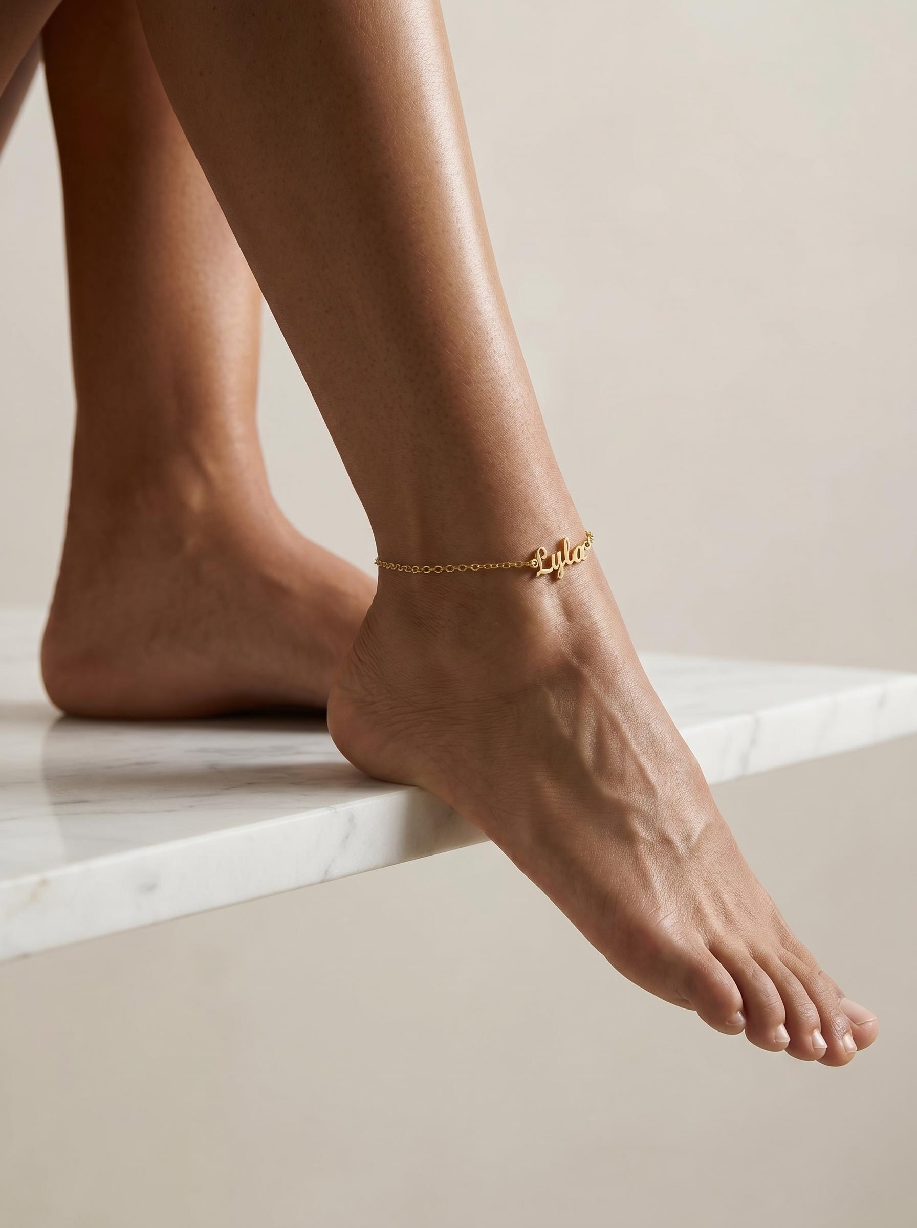
In a minimalist composition, one deliberate detail — worn consistently, framed precisely — becomes a signature rather than a distraction. A custom name anklet in gold sits against clean skin and pale background in a way that reads as intentional style rather than visual noise. It’s the one addition that strengthens a minimalist image rather than complicating it.
Shop Name Anklets →8 Elements That Make Minimalist Feet Photos Premium
A neutral, uncluttered background isn’t empty — it’s negative space that actively directs the viewer’s eye to the subject. In minimalist photography, the background does its job by disappearing. White, cream, pale grey, or natural wood all recede visually in a way that patterned or busy surfaces never do.
Soft, directional light from a window — particularly on an overcast day when the light is diffused and even — produces the most flattering and natural result for feet photography. It brings out skin texture, renders colour accurately, and creates gentle shadow definition without harsh edges. No amount of post-processing replicates it.
Heavy editing — smoothing filters, strong saturation boosts, stylised presets — signals inauthenticity. Buyers in this space are specifically interested in realistic texture and natural appearance. Light editing that corrects exposure and white balance while preserving skin detail reads as honest; heavy processing reads as having something to hide.
Minimalist composition is not the absence of composition — it is composition made visible. Where the foot sits within the frame, how much negative space surrounds it, whether the framing is centred or offset — these decisions are what give a minimalist image its sense of intention. Random placement looks accidental; considered placement looks controlled.
The skin’s natural texture — arch lines, the slight variation in tone across the sole, the detail of individual toes — is what buyers are paying attention to. Minimalist editing preserves this; heavy smoothing destroys it. The paradox of skin retouching in this context is that the more natural you keep the texture, the more visually appealing the image becomes to the buyers most likely to purchase.
Neutral colours — cream, white, warm beige, soft grey — don’t date. Bold or season-specific nail colours and backgrounds create images that read as belonging to a specific moment; neutrals create images that look as current in two years as they do today. The minimalist palette is what gives this aesthetic its longevity.
Minimalist poses are understated — a relaxed natural placement, a gentle point, a slight toe curl — rather than dramatic or performative. The goal is for the pose to feel uncontrived, as though the image was captured rather than constructed. This naturalness is what gives minimalist content its appeal to buyers who find heavily staged photography less engaging.
A minimalist aesthetic only works as a brand identity when it’s consistent. One clean image among a catalogue of varied styles doesn’t establish a brand — it reads as accidental. When every image maintains the same background palette, lighting quality, and editing approach, buyers learn to recognise your visual identity at a glance, which is the foundation of repeat purchases.
How to Achieve the Minimalist Look: Practical Setup
Minimalism requires fewer decisions than complex setups, but those decisions matter more. Here is what each element of a minimalist setup actually involves:
Choose one or two permanent background options and use them consistently. Clean white or cream bedding is the most versatile option — it works in any lighting condition, photographs with a slight warmth that flatters skin tones, and is easy to maintain and replicate. A pale wooden surface or smooth stone tile are strong alternatives for a slightly more editorial feel. Keep it free of folds, creases, and objects. If there’s anything in the background that isn’t serving the composition, remove it before shooting.
Before every shoot: scan the frame on your phone screen, not with your eyes. The camera catches things you don’t notice in person.
Position yourself near a window with indirect or diffused natural light — ideally on an overcast day or with a sheer curtain softening direct sun. The light should come from the side or slightly in front rather than from directly above, which flattens texture. If natural light isn’t consistent enough for your shooting schedule, a ring light positioned at eye level and slightly off-centre produces a clean, even result without the warm cast of most household bulbs. Keep to a single light source — mixing sources creates uneven colour casts that are difficult to correct without heavy editing.
Test before sooting: take a test shot and zoom in to the skin. If the texture is visible and the colours look natural, the lighting is right. If the image looks flat or the skin tones look orange or grey, adjust before continuing.
Minimalist photography magnifies skin condition more than any other style. Without props, elaborate setups, or distracting backgrounds, the viewer’s eye goes directly to the skin. Rough patches, dry heels, and unkempt cuticles read immediately in close-up photography — and in a minimalist image, there is nowhere else to look. A consistent skin care routine in the days before shooting, and a brief pre-shoot routine on the day (exfoliation, moisturising, fresh polish if relevant), is the single most effective investment in minimalist image quality. See our 7-day soft feet guide for the full preparation routine.
Day-before routine: exfoliate lightly, apply urea cream, wear cotton socks overnight. Shoot the next day when skin is at its most even and supple.
The rule of thirds — placing the main subject slightly off-centre rather than dead in the middle — is the most reliable starting point for minimalist composition. It creates visual tension and interest that a centred composition lacks. Leave deliberate negative space on at least one side; this is not wasted space, it is what gives the subject room to read. Test two or three framings before committing: zoom slightly in on the detail that matters most, back out to show the full foot in context, try both vertical and horizontal orientations. In minimalist photography, the strongest composition is usually the one that leaves out the most while still conveying the full subject.
Cropping discipline: if you find yourself cropping in post to fix a framing issue, the composition wasn’t right in camera. Adjust the actual setup and reshoot — cropping reduces resolution and rarely improves composition as effectively as getting it right at the source.
The editing workflow for minimalist feet photography is deliberately short: adjust exposure if needed, correct white balance if the colour is off, add a small amount of clarity or texture to bring out skin detail, and stop. Every additional adjustment moves the image away from the natural, authentic quality that makes minimalist content appealing. Smoothing tools, heavy saturation adjustments, and stylised filters all work against the aesthetic — their visible effect is the opposite of what minimalism is trying to communicate. A useful benchmark: if you can see the editing, you’ve done too much.
The three-step rule: brightness → white balance → clarity. If the image still doesn’t look right after these three, the problem is in the shoot, not the edit. Reshoot rather than trying to rescue it in post.
Minimalist Shoot Setup: Quick Reference
| Element | Minimalist Standard | What to Avoid |
|---|---|---|
| Background | White, cream, pale grey, or natural wood — single plain surface | Patterned fabric, busy textures, multiple surfaces in one frame |
| Lighting | Soft natural window light or single ring light at 5000–6000K, positioned to the side | Mixed light sources, harsh overhead lighting, heavy warm cast from household bulbs |
| Skin | Moisturised, exfoliated, well-groomed — natural texture preserved | Dry or rough skin that reads in close-up, over-smoothed editing |
| Nail detail | Clean nude, soft pink, or natural — consistent across sessions | Chipped polish, heavily trend-specific colours that date quickly |
| Pose | Natural, relaxed, slightly off-axis — uncontrived appearance | Overly staged or dramatic positions that look performed rather than found |
| Editing | Exposure correction, white balance, light clarity — three steps maximum | Smoothing filters, bold presets, heavy saturation or contrast boosts |
| Props | None, or a single intentional detail (a gold anklet, a stem of dried florals) | Multiple props, branding materials, objects that compete with the subject |
| Consistency | Same background and lighting across the catalogue for brand recognition | Varied setups that prevent buyers from recognising your visual identity |
Building a Minimalist Brand That Buyers Recognise
The individual image is the starting point. The catalogue is what builds the business.
A single clean, well-composed image tells a buyer you can produce professional content. A catalogue of consistently clean, well-composed images tells them you do it reliably — and reliability is the quality that converts first-time buyers into repeat customers and repeat customers into the source of stable monthly income.
- ✦Choose your palette and keep it. Pick one or two background colours and one or two nail colour directions (neutral/natural or a specific soft palette) and maintain them across your catalogue. Buyers who visit your profile should be able to tell immediately what your visual world looks like. Consistency is not repetition — you can vary angles, poses, and details within a fixed palette without losing the coherence that makes the brand recognisable.
- ✦Use your profile image as your brand statement. Your profile photo is the first thing a buyer sees. It should be your best minimalist image — clean background, perfect light, well-groomed skin — and it should represent the visual quality of your catalogue as a whole. A mismatched profile image (styled differently from your content) creates a disconnect that reduces buyer confidence before they’ve looked at a single piece of content.
- ✦Post consistently, not abundantly. Three or four strong minimalist images per week is more effective than daily uploads of variable quality. In a minimalist aesthetic specifically, the gap between strong and weak images is more obvious than in more heavily styled content — a single off-standard image in an otherwise clean catalogue is more jarring than it would be in a varied portfolio. Quality gate every upload.
- ✦Offer custom content within your aesthetic parameters. Buyers who respond to your minimalist style will often want custom content — specific angles, specific nail colours within your palette, close-up details. Accepting custom requests within your established aesthetic generates premium income without requiring you to change your brand. State clearly in your profile that custom orders are available and what the parameters are.
- ✦Resist the pressure to add complexity. The most common mistake in minimalist content is gradual drift — adding a prop here, a filter there, a more dramatic pose session — until the aesthetic that originally attracted your buyers has been diluted. If something isn’t consistent with the visual world you’ve established, leave it out rather than publishing it under the same profile. Coherence compounds over time into brand identity; inconsistency compounds into confusion.